Power BI Assessment

%402x.svg)

After years of working with dashboards, we know what is important to create a good one.Each dashboard is different and specific to its own, but there are rules every report should follow to maximize usability and bring as much business value as possible. This article presents the most important reporting standards that are necessary to keep in mind while creating BI dashboards.
The main goal of the report is to provide information. Creating meaningful, easy-to-read visuals should be prioritized over appealing looks. Of course, it's better to work with a nice-looking report compared to an ugly one, but good appearance should not distract from reading the data.
The best way to illustrate this is through FusionCharts and their examples of dashboard navigation errors. We recommend paying special attention to examples 7 and 9, which perfectly depict this situation.
There are lots of visual types, but most reports can be created using the most popular ones – line charts, bar charts, pie charts, scatter plots, matrices, and tables. Other charts should be used only in specific cases, as creating a complex visual – even if insightful – may be hard to read for users accustomed to basic types.
Different visual types are best for different insights:
Since there are many articles and decision-making frameworks regarding visual selection (such as one by the Financial Times), the purpose here is to draw attention to this topic.
All elements of the report should be normalized. For example:
Normalization also applies to layout. It's easier for users to navigate if each page follows a template (e.g., top pane with logo, title, filters, etc.).
There's no need to emphasize the same information multiple times.
Likewise, avoid redundant text:
If a chart already shows monthly sales, there's no need to label the Y-axis as "Sales", title as "Monthly Sales", and include a legend with "Sales" again. One indicator is enough.
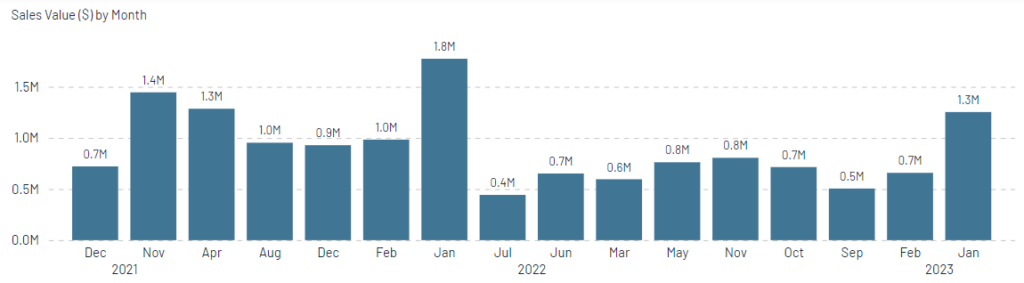
Basic, clear and easy to read chart
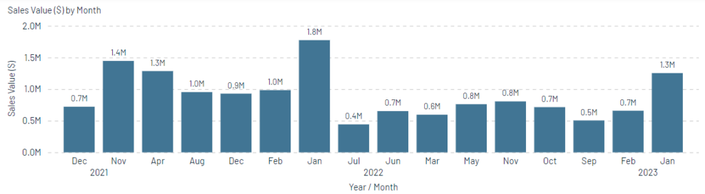
Redundant X and Y axis titles
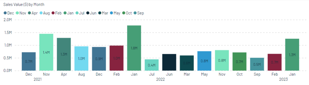
Nonintuitive and not needed coloring of categorical axis. The Rule 5 'Be consistent,' developed by Marco Russo and Alberto Ferrari in 15 Rules to Design a Perfect Dashboard.
Users must always know what they’re looking at — in terms of selections, KPIs, and functionalities.
It’s worse to show misleading data than to show nothing at all.
Each selection must result in either meaningful info or a clear explanation for a blank result.
Clarity also means users should know which controls affect which visuals. For example:
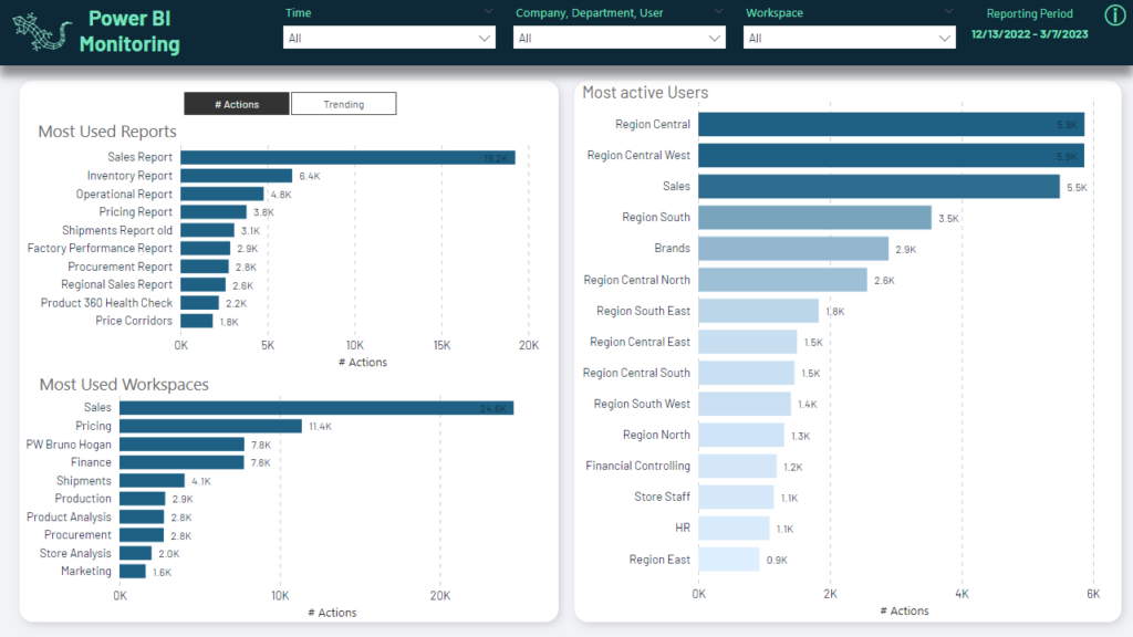
A good report should not require training. But if needed, include:
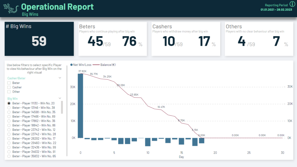
This page is not self-explanatory. That’s why there's help text and info icon after hovering.
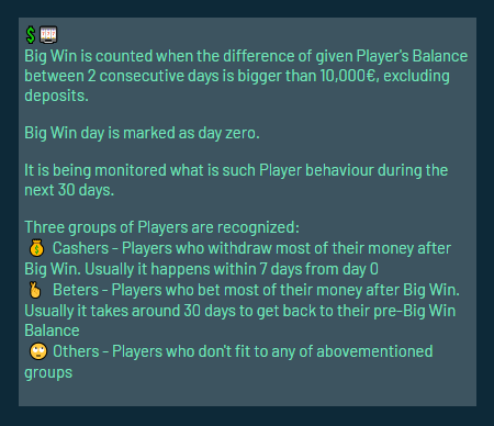
Always clarify units of measure: is it value (currency), volume (units/kg), or percentage?
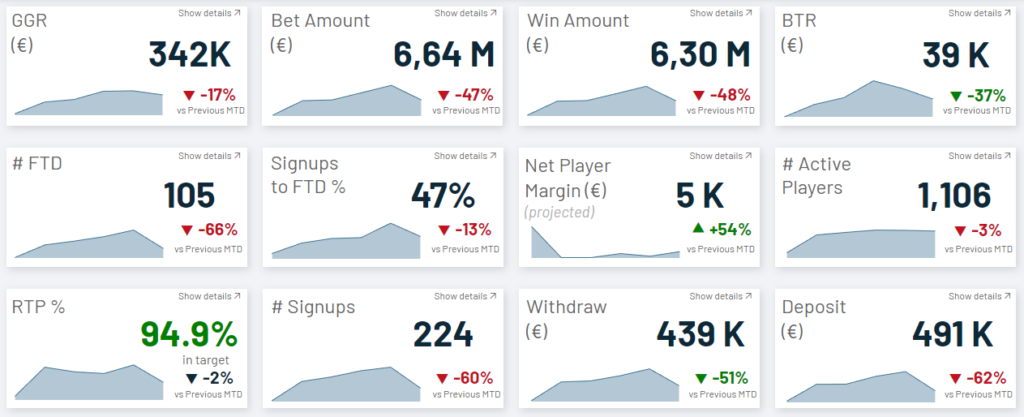
Every report has information of varying importance. It’s the designer’s role to guide user attention through:
Top-left is usually the most visible and valuable area.
Proper coloring supports analysis. Use pastel colors – they are typically well received. Build a palette with:
Be cautious with red/green due to strong emotional connotations.
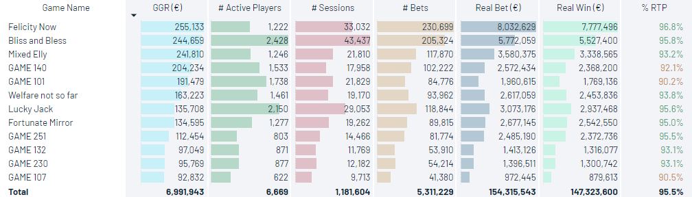
Adoption = Users actually using the report.
First impressions matter! Common obstacles:
Applying the standards described above supports smooth adoption and ensures that reports bring real business value — the ultimate goal of any BI project.
